Brand Identity

One idea.
Every touchpoint.

We build complete identity systems: logo, typography, color, imagery, voice and applications designed to stay recognizable everywhere your brand appears.
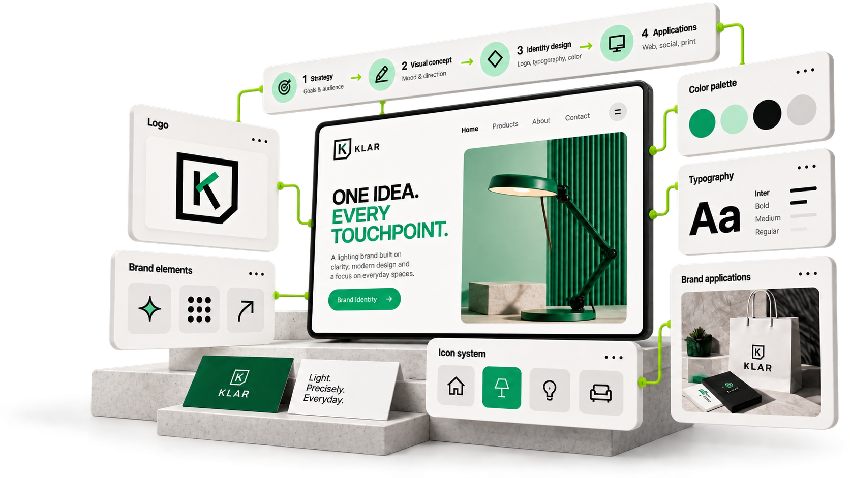
One brand identity system: logo, typography, colour, graphics and applications

01 · Brand foundation

Before the mark,
define the meaning.
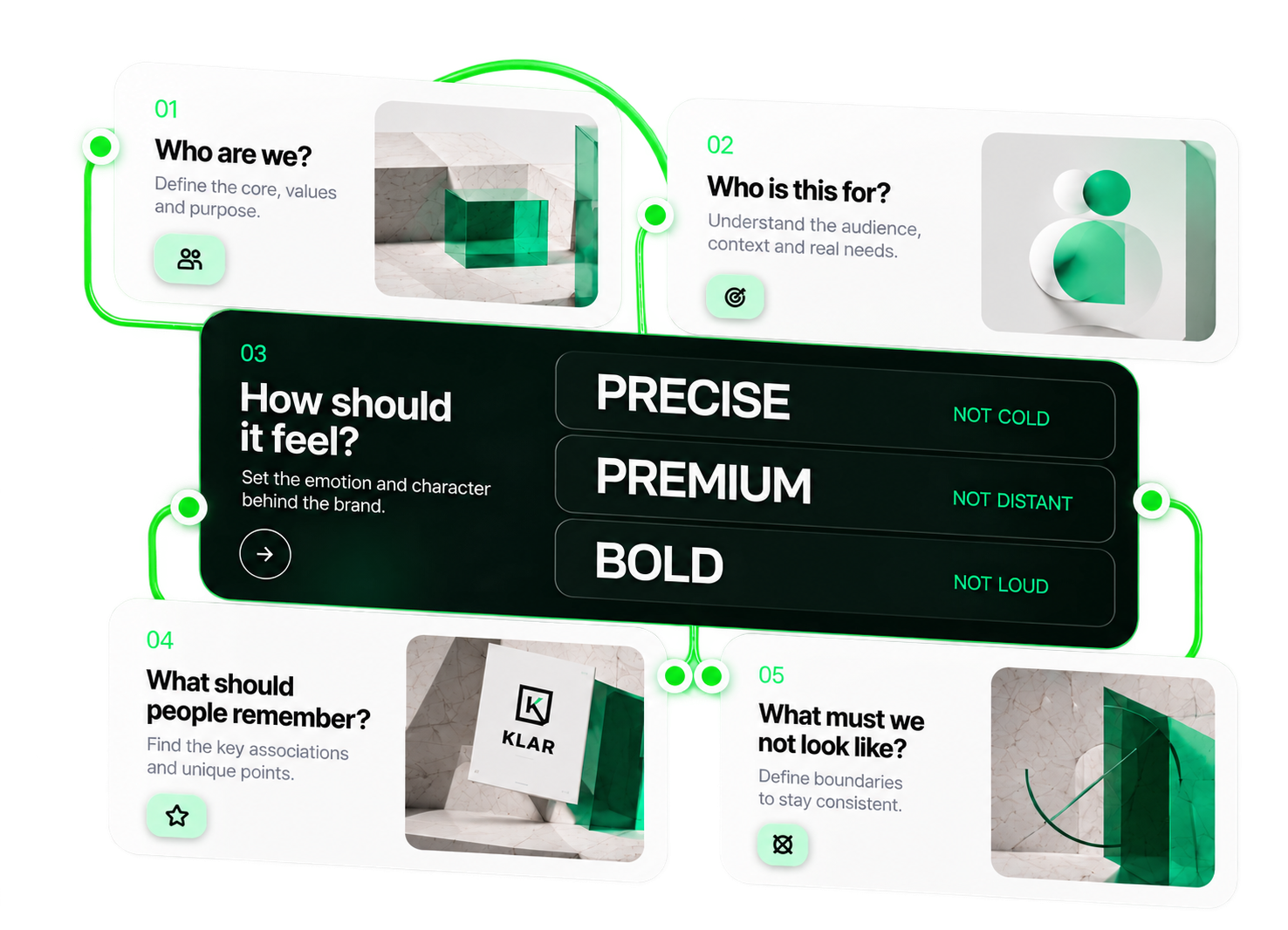
Five questions first. The answers become a direction every design decision can be checked against.
Five brand foundation questions converging into a brand direction: precise, premium, bold

02 · Competitive space

Stand apart
for a reason.

We map the visual territory competitors already own — then place the brand where it can be remembered.
01
Analyse the market

Identify key players, visual trends and category codes.

02
Find the gaps

Discover opportunities to stand out and own a unique position.

03
Define the direction

Position the brand at the intersection of strategy, aesthetics and audience needs.

04
Turn it into a system

Apply the positioning across visual identity, content and touchpoints.
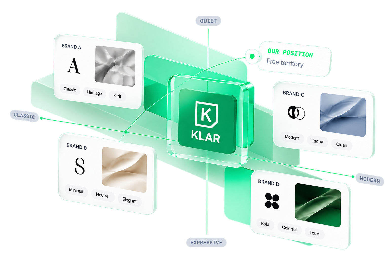
Visual territory map: competitor brands on classic–modern and quiet–expressive axes, KLAR in the free territory

03 · The core idea

The system needs
one strong idea.

One word becomes four visual rules. Every later decision comes from them — nothing is random.
Precision
01
Align

Unite strategy, audience and business goals.

→

02
Cut

Remove the unnecessary to keep it clear.

→

03
Frame

Build a consistent visual structure.

→
04
Repeat

Apply the rules across all touchpoints.

→

04 · Logo system

A logo has to
work everywhere.
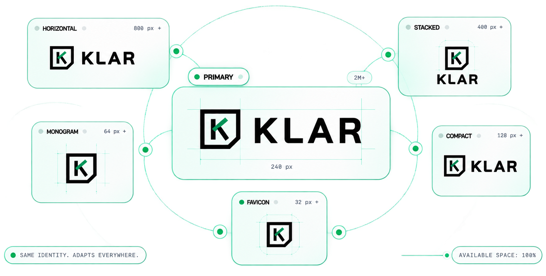
One identity, six versions — primary, horizontal, stacked, compact, monogram, favicon. Each drawn for its space.
Primary2M+
KLAR
Horizontal800 px
KLAR
Stacked400 px
KLAR
Compact128 px
KLAR
Monogram64 px
Favicon32 px
Primary

05 · Colour system

Colour
should be ownable.
Roles, not swatches: what leads, what accents, what stays quiet.
01Primary
Green
#00B979
+
02Accent
Mint
#9BE8C5
+
03Neutral dark
Ink
#0B0F0D
+
04Neutral light
Mist
#F2F5F3
+
LIGHT,
PRECISELY.
01
Background
Book a site visit→
02
CTA
KLAR packaging
03
Packaging
KLAR embossed print
04
Print

06 · Typography

Type is
the voice you see.
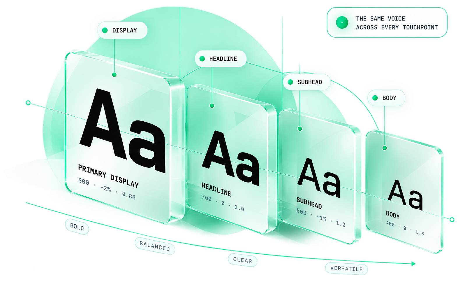
A hierarchy with weight, spacing, case and line-height decided — so every channel sounds the same.
01
Clear hierarchy
Different roles, one system.
02
Consistent rhythm
Balanced spacing and line-height.
03
Flexible usage
Works across all formats and devices.
04
Distinct character
Modern, confident, memorable.
Explore typography→
Type hierarchy: primary display, headline, subhead and body as one system

07 · Graphic language

Give the brand
a visual grammar.
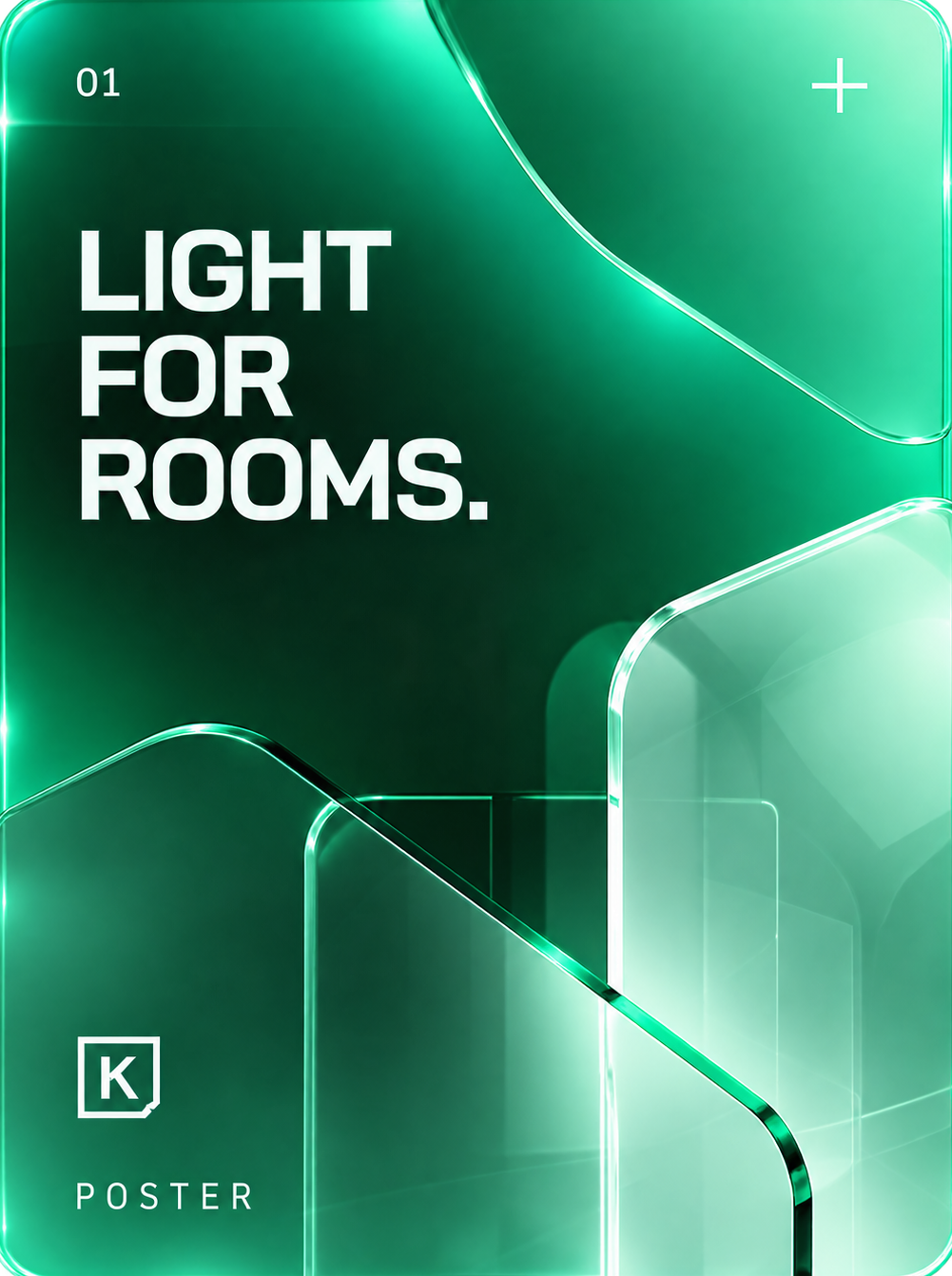
Supporting graphics make the brand recognizable even when the logo isn’t there.
Poster in the KLAR graphic language
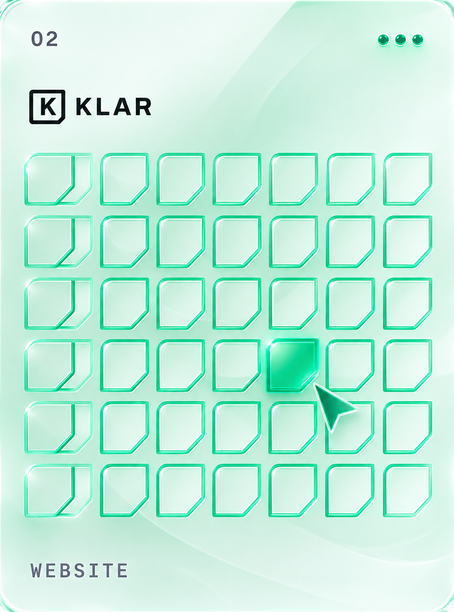
Website in the KLAR graphic language
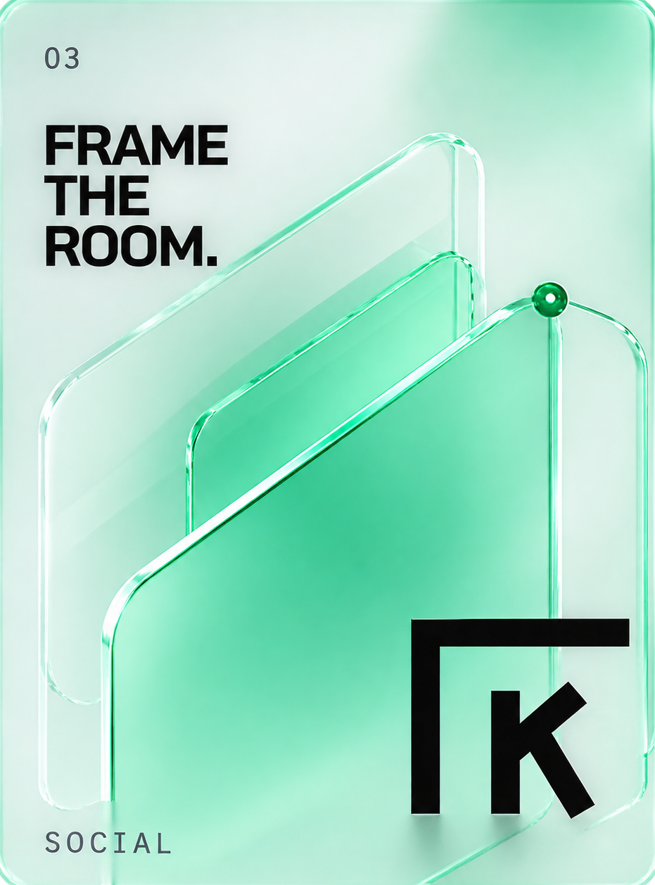
Social in the KLAR graphic language
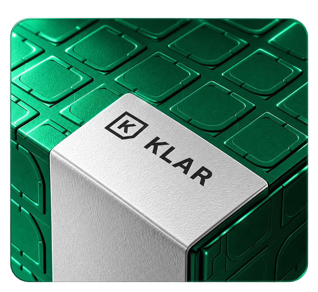
Package in the KLAR graphic language
Cut-corner frameOne diagonalGreen fieldRepeat, never rotate

08 · Do / don’t

Consistency
needs rules.

✓
Do

Keep clear space around the logo to ensure maximum visibility and impact.
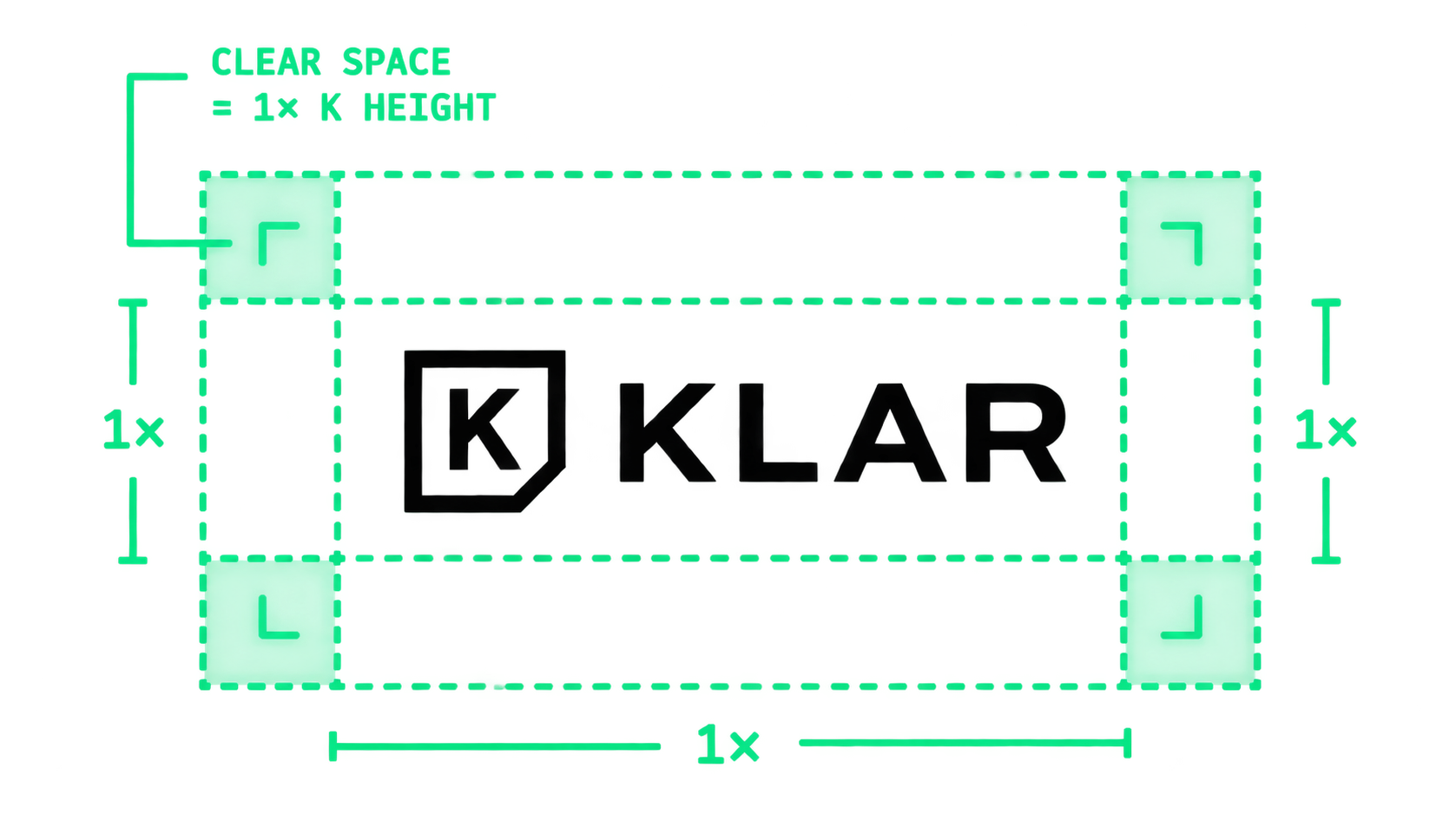
Correct clear space around the KLAR logo
As designed
✕
Don’t

Do not stretch, crowd or alter the proportions of the logo in any way.
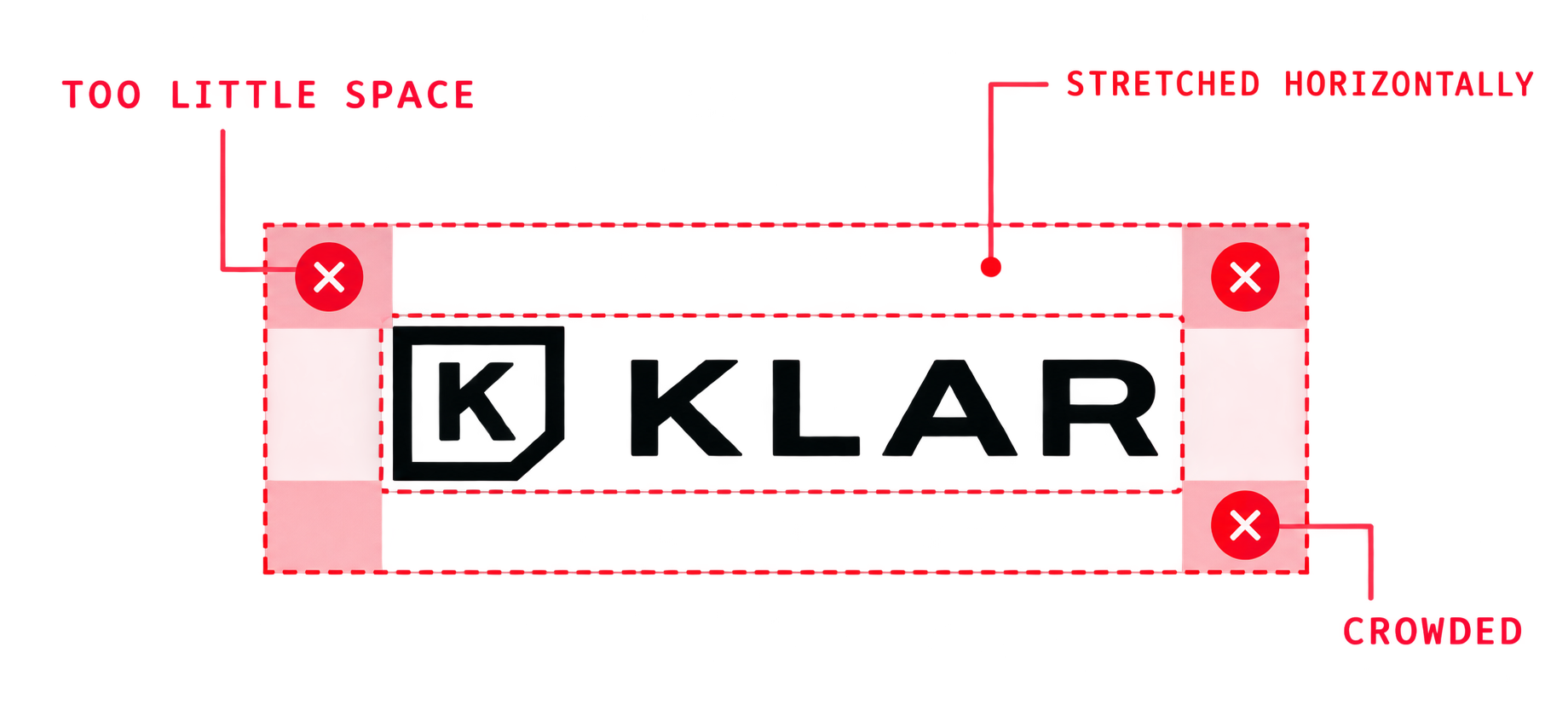
Stretched and crowded KLAR logo
Stretched, crowded
Do

09 · What brand identity is not

Not just
a mark in the corner.

✕No · a logo without a system
Sale!! 🔥
Up to 70% off everything
SHOP NOW
✕Random colours
Klar Lighting Co.John Smith — Manager · +1 555 0101
✕Different type
logo_final_v3.png
✕One logo file
K
klarMENU
✕No image rules
KLÅRorganic lamp
✕No system
Our Company Presentation 2026
✕Channel by channel
✓Yes · a brand system
01 · Logo system
KLAR
KK
02 · Typography
Display
Heading
Body — light, precisely.
LABEL
03 · Colour
Primary#00B979
Secondary#9BE8C5
Dark#0B0F0D
Neutral#F2F5F3
White#FFFFFF
05 · Imagery
06 · Voice
Light,
precisely.
Book a site visit →
That page moved. Here’s the way back.
04 · Graphic language
07 · Applications
KLAR
KLAR
NEW
WORK
klar.studio
WebsiteStationerySocial mediaPresentation
08 · Guidelines
KLARxxxx
Clear space = x
Logo ≠ identityOne system. Every touchpoint.

10 · Who this is for

You probably need a stronger identity if…

01Your logo is the only thing holding the brand together
02Your website and print materials look like different companies
03Every designer interprets the brand differently
04Your business has grown past the identity you started with
05Your brand looks interchangeable with competitors
06You don't have rules for typography, imagery or colour
07The logo breaks in small or unusual formats
08You need a system future teams can actually follow
FAQ

Straight answers.

What is included, what you receive, and who owns it at the end.

The logo and its variations, a color palette, a typography system, plus supporting elements like iconography, all documented in a brand book. In this engagement it also includes the collateral you hand out, designed and then prepared for print.

Ready when you are

Build a brand
people recognize.

One idea, turned into a logo system, type, colour, graphics, voice and applications — documented so anyone can use it.