Web Design

Design
the decision.

Conversion-focused web design built around how your buyers think, what they need to understand, and the action each page should drive.
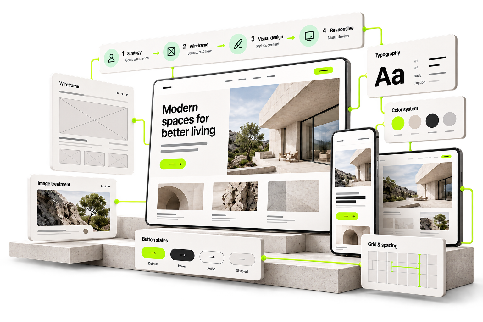
One website design system: strategy, wireframe, typography, colour, button states, grid and responsive desktop, tablet and mobile screens.

01 · Before design, decide the path

Before the pixels,
we design the path.
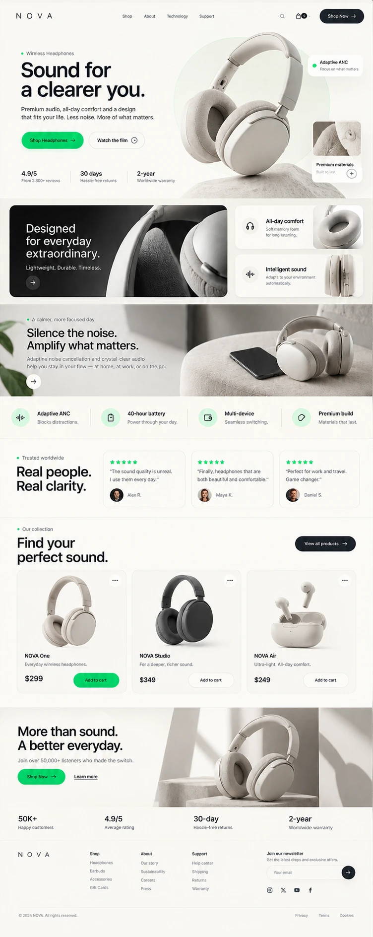
Every section answers the next question a buyer has. We design that order first.
A full product landing page — each section answers the next buyer question
01
Visitor lands

Two seconds to answer: is this for me?

02
Understands the offer

What it is, who it is for, why it is different.

03
Understands the process

How it works — so the next step feels safe.

04
Sees proof

Reasons to believe, placed before the ask.

05
Handles the objection

The question that would have stopped them.

06
Takes action

One clear next step, when they are ready for it.

02 · Information architecture

Every page
needs a job.
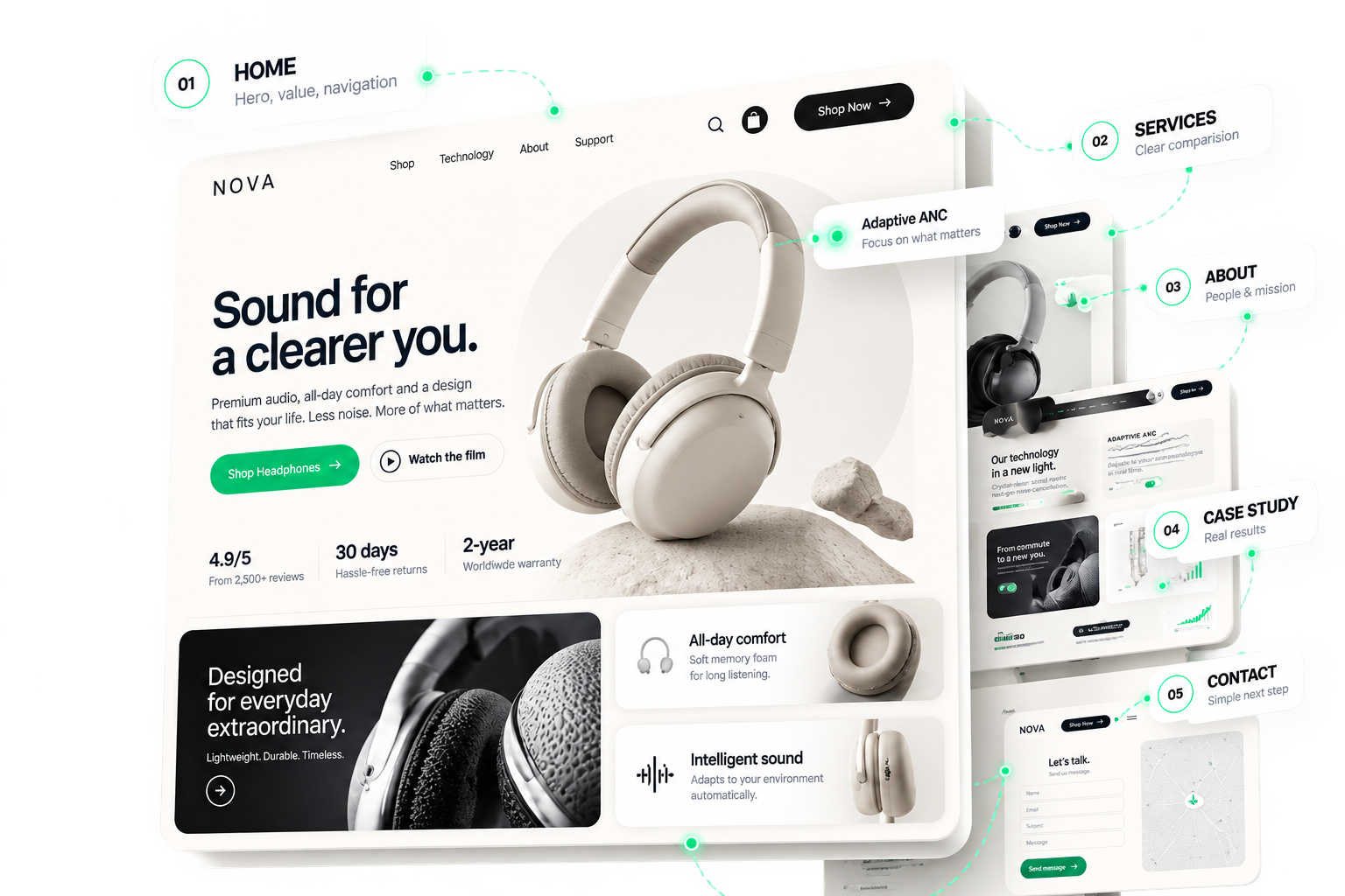
Not “how many pages” — why each one exists, and the one thing it should get the visitor to do next.
A site map in motion: Home, Services, About, Case study and Contact pages, each with its own job

03 · Wireframe → finished design

Structure first.
Style second.
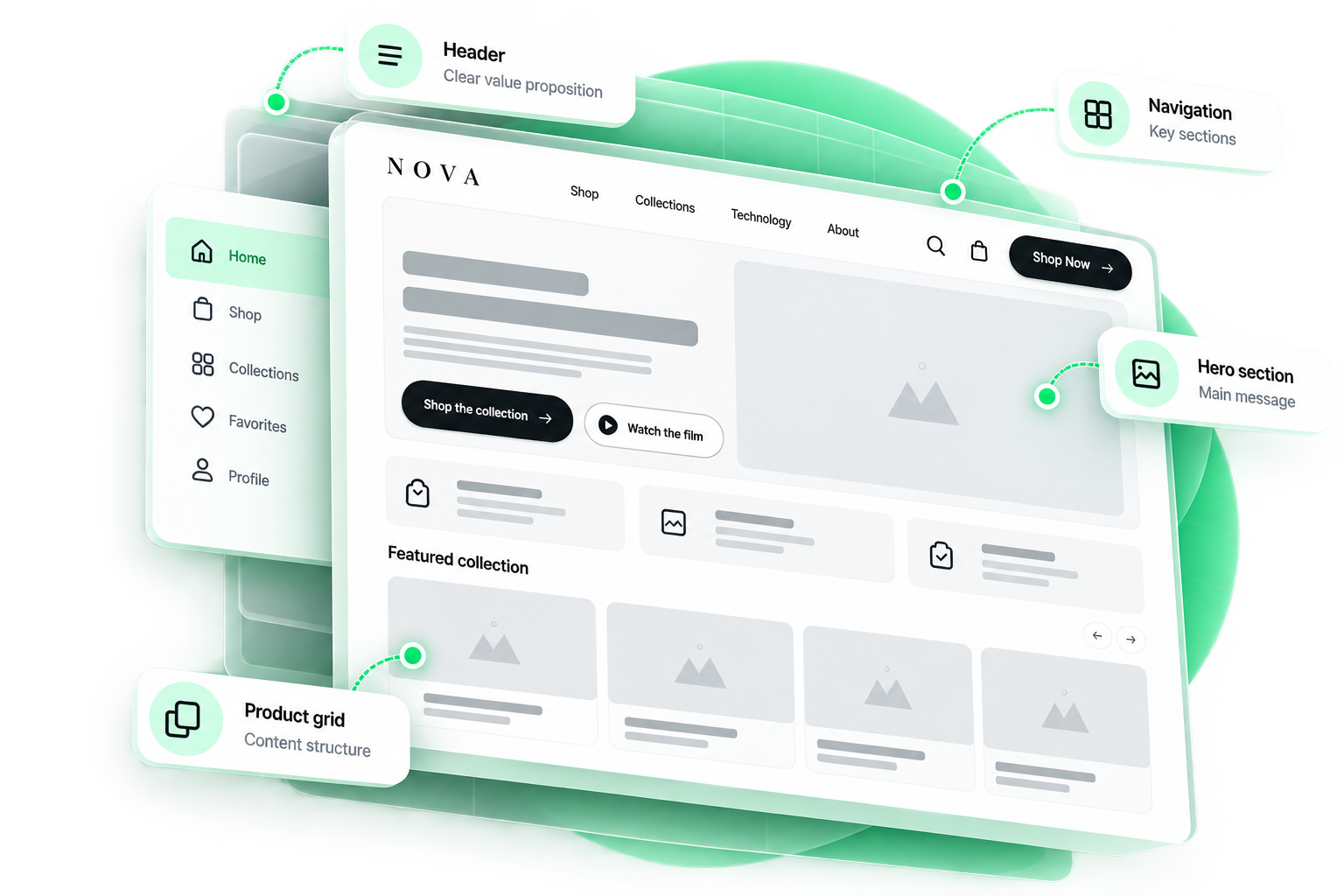
One page. Scroll, and the skeleton becomes the finished design.
Wireframe stage of the same page

04 · Real copy, not lorem ipsum

Design with
the real message.

The real headline is longer, the proof needs space, the CTA needs a verb. Content changes the composition — so it goes in first, not after sign-off.
01
Placeholder

We start from real structure and hierarchy, so your message has a place to land.

→
StructureHierarchy
Sound for
a clearer you.

Premium audio, all-day comfort and a design that fits your life.

Shop headphones →
Inter
Regular
Medium
Semibold
Bold
Size72
02
Real message

Your actual headline, proof and CTA go into the layout — not lorem ipsum.

→
TypographyContent
Spacing
Section120
Block80
Element24
12024
03
Layout adjusts

Spacing, alignment and layout are tuned around the real words, on every device.

→
SpacingLayout

05 · Design system

Not a collection of pages.
A system.

Type, colour, controls, spacing and components — defined once.
Typography
H1
Design the decision.
H2
Every page needs a job
Body
Built around how your buyers decide.
Label
Web design · 2026
Colour
PrimaryHiKit Green#00B979
DeepForest#0A6B47
InkInk#0B0F0D
NeutralMist#F2F5F3
Controls
Start my design →Talk to us
you@company.comemail
Height48RadiuspillEase200msRing4px
Spacing & grid
4xs
8s
16m
24l
40xl
562xl
242416
12 col24 gutter56 margin
Components
HIKITWork ServicesStart
Web designFrom discovery to handoff
Do you design mobile?−
Can our team build it?+
Ready to start?Book →

06 · Mobile

Mobile is a
different composition.
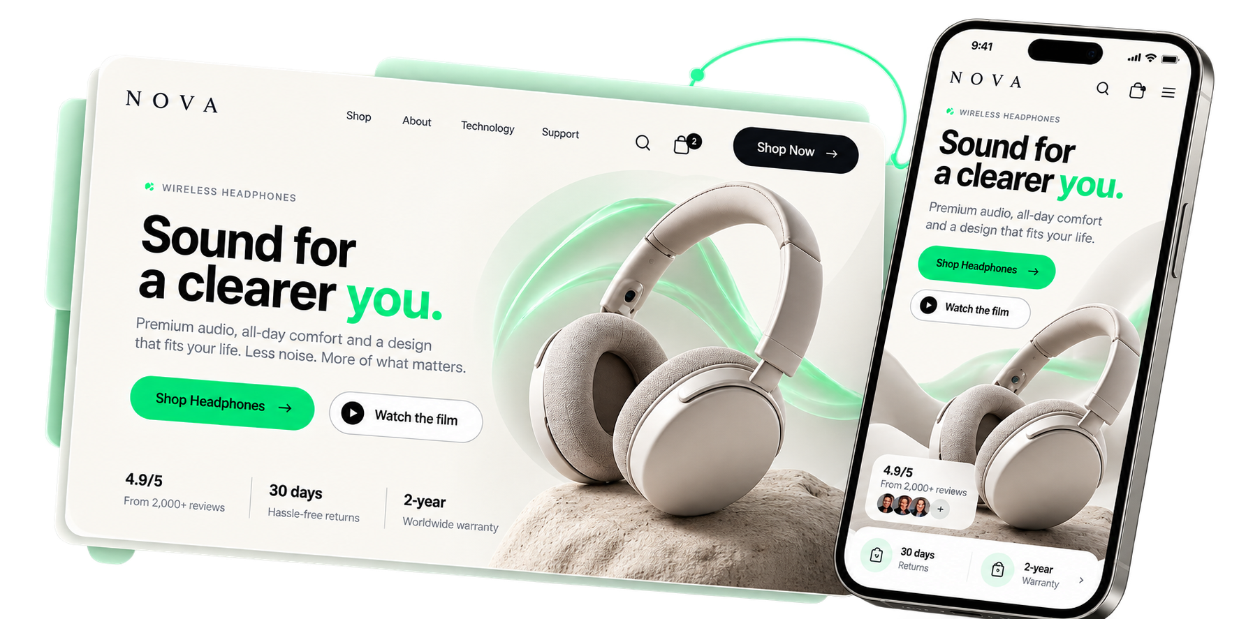
Numbers show the reading order. On mobile it changes on purpose.
The same hero as a desktop section and as a re-composed mobile screen
01
Order
Headline → image → copy → CTA
02
Crop
Full-bleed, product centred
03
Font scale
Bigger, tighter leading
04
Spacing
Larger vertical rhythm
05
Interaction
Touch targets ≥ 48px
06
Priority
One primary CTA, clear hierarchy

07 · Conversion moments

Every page needs
a clear next step.

The ask grows as confidence grows. A CTA appears when it has been earned.
01
Understand

Bring them in with a clear, compelling story.
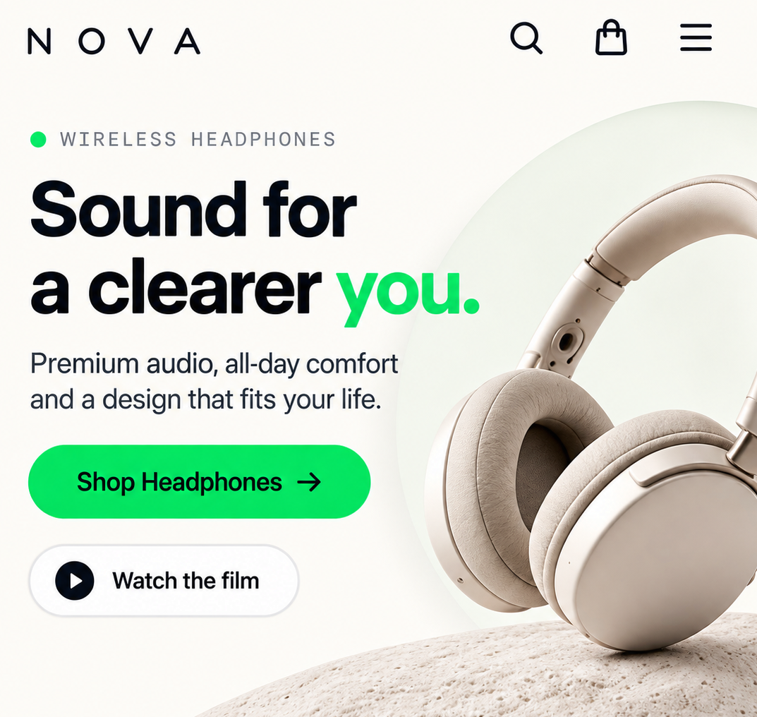
Understand — Shop the collection
Shop the collection
Soft · primary
02
Compare

Help them explore options and see the differences.
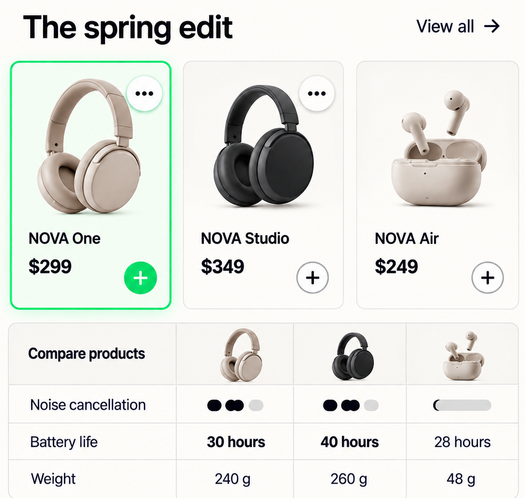
Compare — View all products
View all products
Text link
03
Trust

Show proof, details and real reasons to choose.
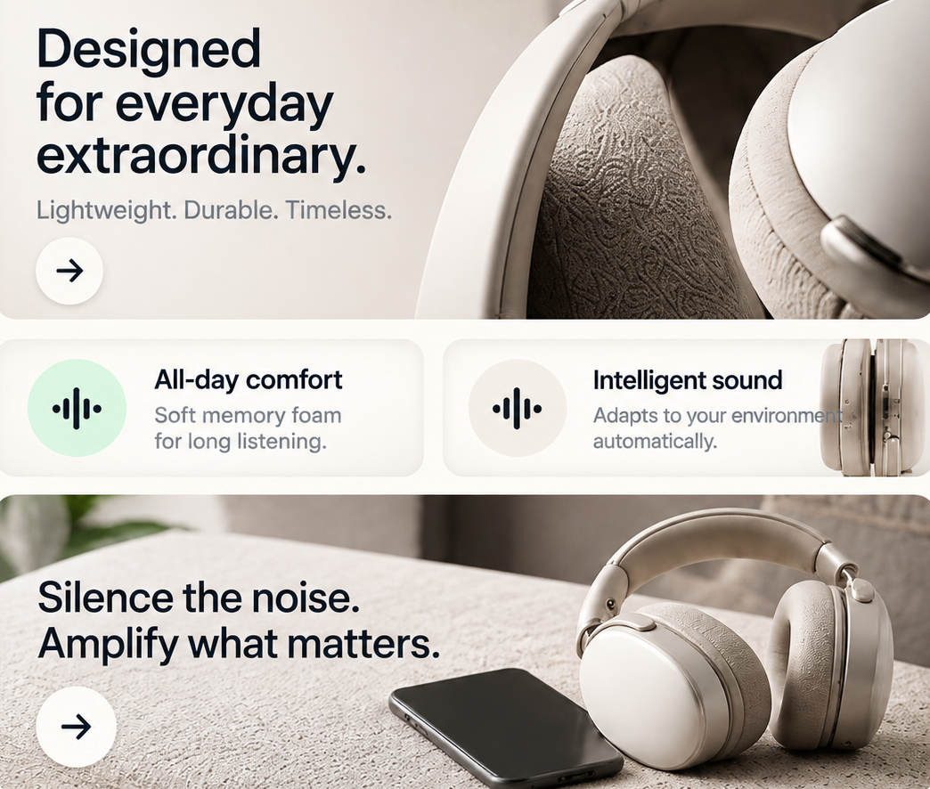
Trust — Read how it's made
Read how it's made
Quiet link
04
Act

Make the next step feel natural, timely and low-friction.
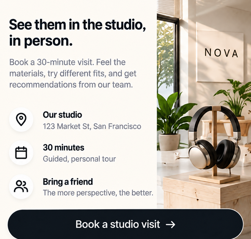
Act — Book a studio visit
Book a studio visit
Full · final

08 · Selected work

Designed for
different kinds of decisions.
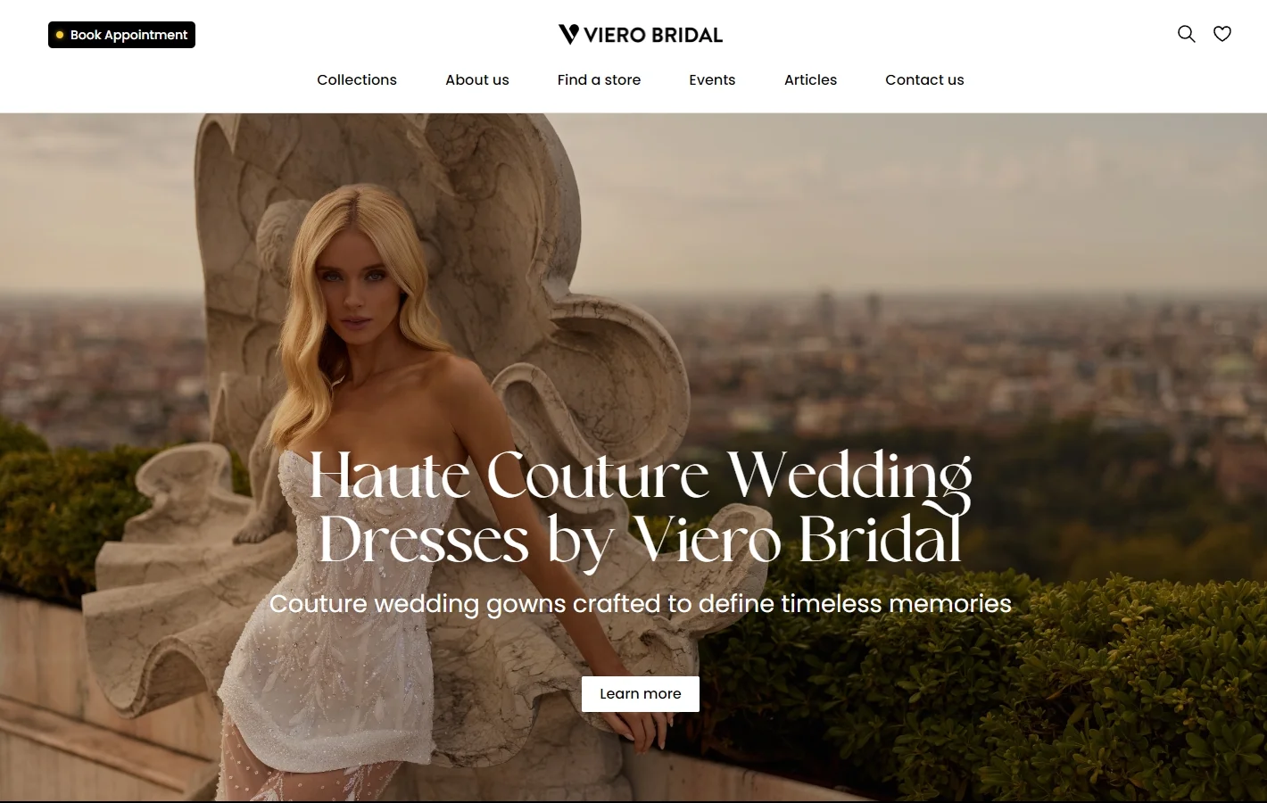
Different industries, different decisions — no shared template.
Viero Bridal website — design by HiKit

09 · From brand to screen

Your website should
feel like your business.
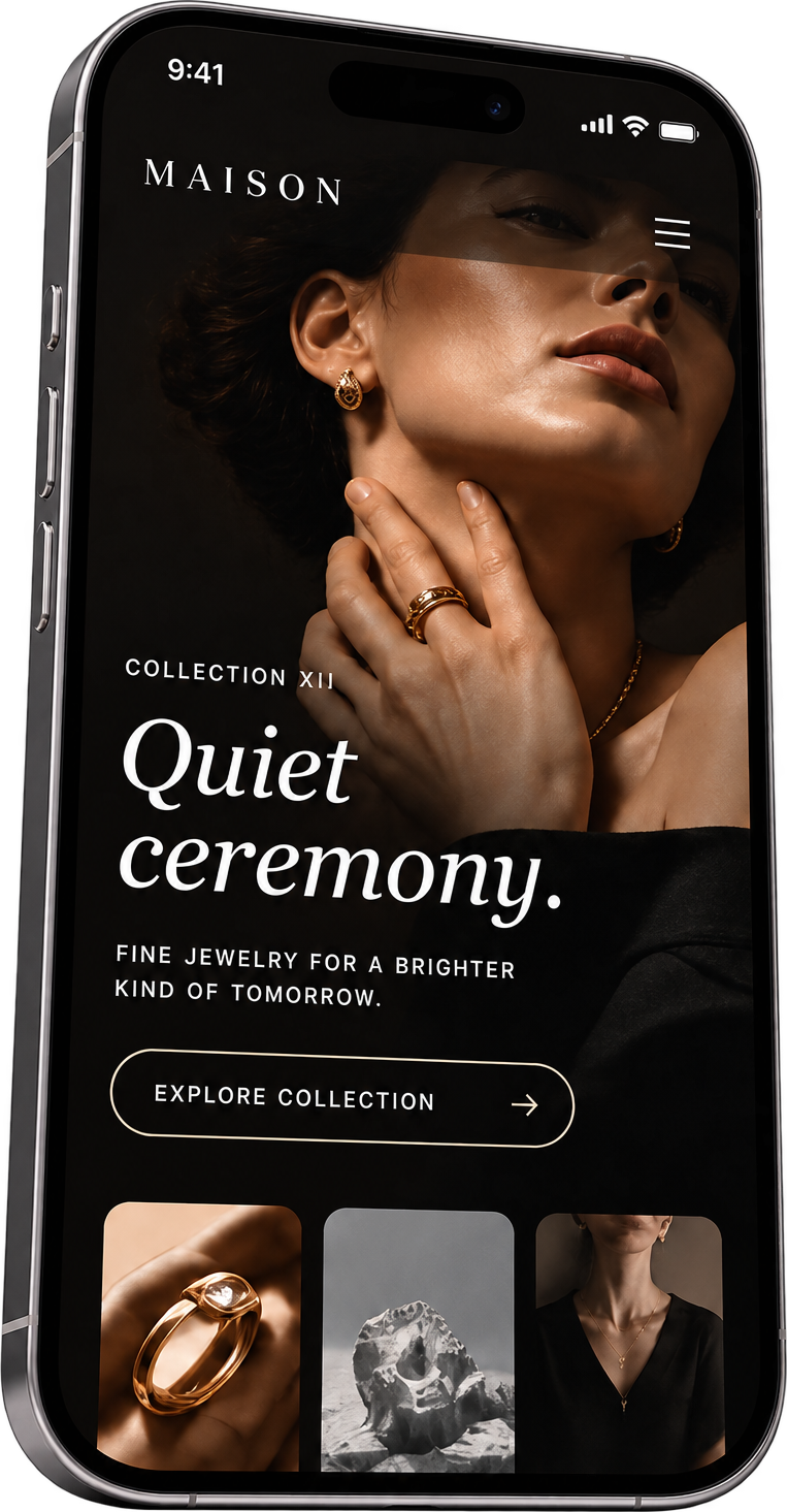
Illustrative directions. We never lay one visual template over every business. Each website is crafted around your industry, audience and goals.
Luxury website direction on mobile
LuxuryCinematic · editorial · timeless
Medical website direction on mobile
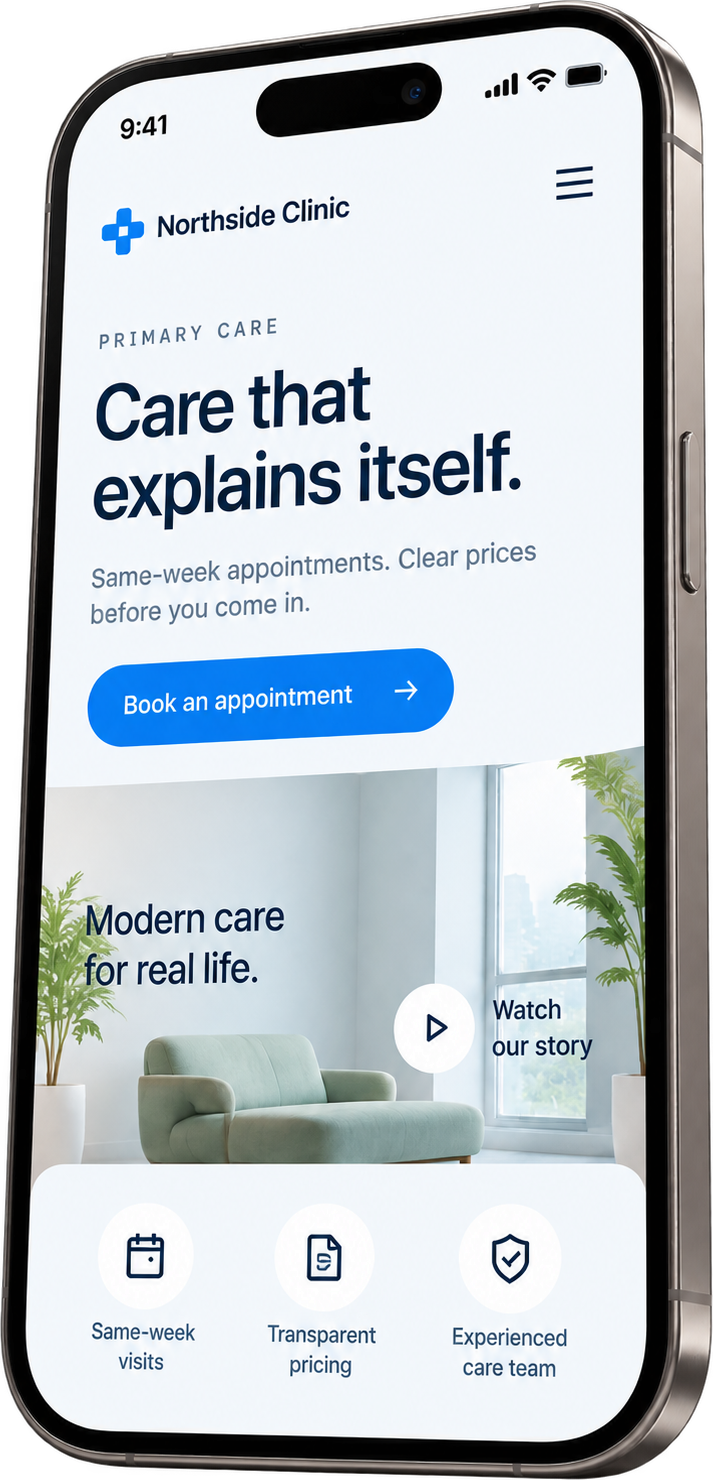
MedicalClean · calm · trusted
Tech website direction on mobile
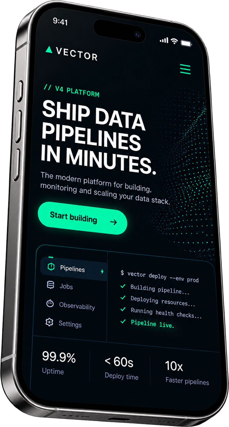
TechPrecise · dynamic · technical
Luxury

10 · What web design is not

Not decoration.
Not a template.

A pretty page with no path is still a guess. We design a system: a clear journey, real content and one obvious next step on every screen.
✕No — without a system
www.company-site.com/home
🎉 SALE!!! Subscribe now for 10% off — limited time!!
Company™
HomeAboutServicesBlogNewsFAQTeamShopContact
✕No path
Welcome to Our Website!
Lorem ipsum dolor sit amet, consectetur adipiscing elit, sed do eiusmod tempor.
Learn moreCLICK HEREGet startedContactRead
✕5 CTAs
stock-photo.jpg
OUR MISSIONWe are passionate about excellence and quality solutions.✕Random section
★
Service 1
Lorem ipsum dolor sit.
★
Service 2
Lorem ipsum dolor sit.
★
Service 3
Lorem ipsum dolor sit.
★
Service 4
Lorem ipsum dolor sit.
✕Template✕Lorem ipsum
FeatureBasicProPremiumEnterpriseUltimate
✕Desktop onlyClick here for more info »✕No purpose
WHAT PEOPLE SAY‹ ›
“Great service, highly recommend!!” — John D.
★★★★★
Don't miss out!!
SUBMIT
PrivacyTermsSitemapCareersPressLinks
© Company™ All rights reservedfinxytig
💬 Chat with us!
✓Yes — designed as a system
ATLASServicesAboutBook
Clear path
Move without
the pain.

We find the cause, not just the symptom — then build a plan you can follow at home.

Book an assessment →
JM
Jamie M.
Sports physio
Next available · Thu
9:0011:3016:00
Confirm 11:30 →
✓Chartered physios✓Same-week slots✓Insurance acceptedReal content
How it works
Three steps. One plan.
See treatments →
1
Assess
45-minute exam to find the real cause.
2
Treat
Hands-on care matched to your body.
3
Strengthen
A home plan so it doesn’t come back.
RK

“They explained exactly what was wrong and what we'd do about it.” — Patient story (sample)

Ready to move again?Next actionBook →
Buyer journey
Land
Understand
Trust
Act
Responsive · 390
ATLAS
Move without the pain.

We find the cause, not just the symptom.

9:0011:3016:00
Book an assessment
System tokens
Aa
4 → 40

11 · Who this is for

You probably need better web design if…

01Your website looks fine but doesn't explain the business clearly
02Visitors don't know what to do next
03Every page feels like a different design
04The mobile version feels like a compressed desktop site
05Your brand is stronger than your website
06Your current site feels like a template
07You need a design system that can grow
08Your developers keep guessing how the design should behave
FAQ

Straight answers.

What the design covers, how it gets built, and what you receive at the end.

It means designing the site around the action you want a visitor to take, not just how it looks. Every page has a clear purpose, a logical flow, and one obvious next step, so visitors move toward booking, buying, or enquiring instead of getting lost or distracted.

Ready when you are

Design a website
people know how to use.

From buyer journey to a beautiful, build-ready system — structure, content, visual language and responsive behaviour, designed as one.