Your visitors make a decision in about four seconds: stay or leave. Most never scroll, never read your carefully written about page, never see your portfolio. They glance, judge, and act. Conversion rate optimization is the discipline of winning those four seconds, and then removing every bit of friction between "interested" and "done."
Here's the part that should excite you: improving conversion is almost always cheaper than getting more traffic. Lift your rate from 1.5% to 2.5% and you've increased leads by two-thirds from the same visitors you already paid to attract. So before you spend another dollar on ads, work this list. It's 32 specific, prioritized fixes, most doable this month, many in an afternoon.
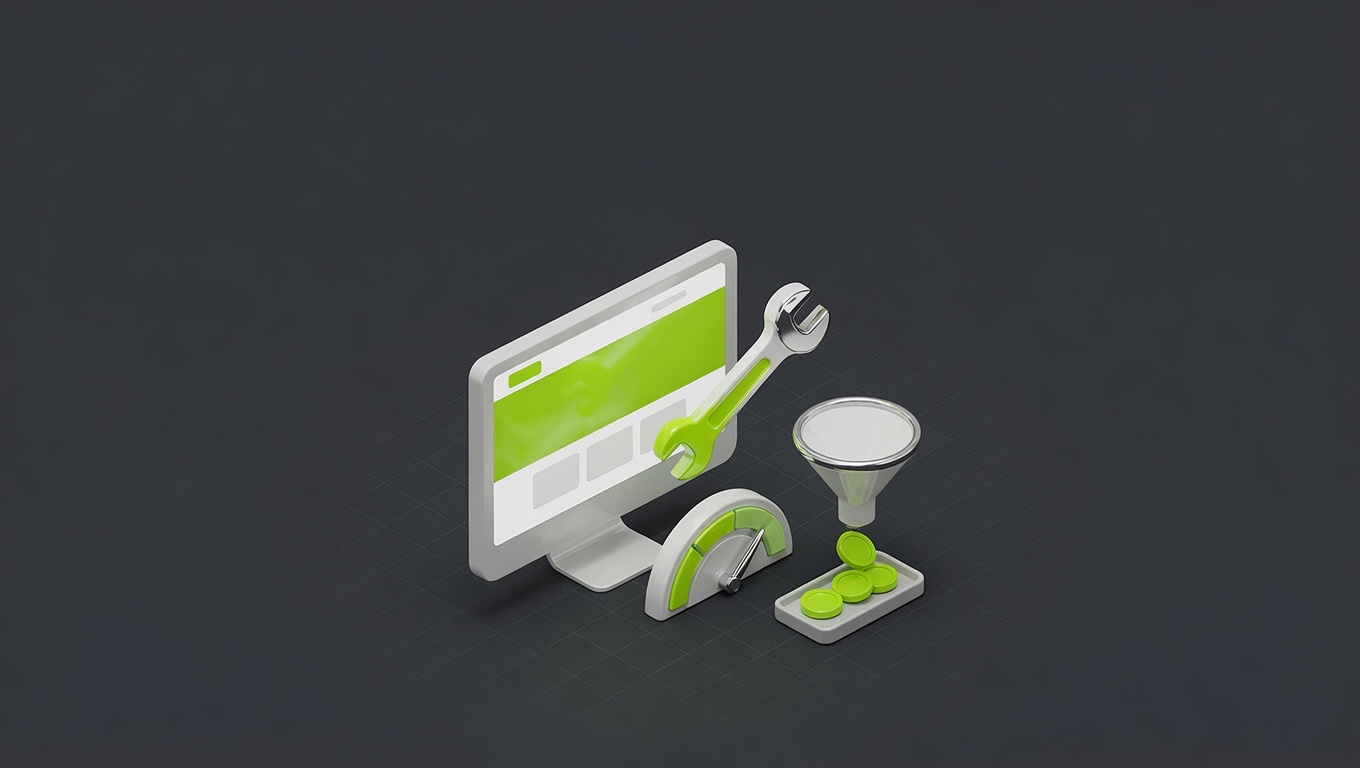
The four buckets
Every conversion fix falls into one of four areas. They're ordered by impact, and within each, we've flagged the quick wins. Here's the overview, then the full checklist:
The 32 fixes, in four buckets
Work top-left to bottom-right; that's also roughly the order of impact.
Above the fold
What visitors see in the first 4 seconds decides whether they stay. Headline clarity, a visible primary CTA, social proof, and a fast-loading hero do most of the heavy lifting here.
Forms & CTAs
The mechanics of converting interest into action. Fewer fields, specific button copy, one primary action per page, and removing friction at the exact moment someone's ready to commit.
Trust & proof
People buy from businesses they believe. Testimonials, real photos, guarantees, and specifics turn a skeptical visitor into a confident one.
Speed & technical
Every second of load time and every mobile glitch quietly costs you conversions you never see. The least glamorous bucket, often the highest ROI.
Now the specifics. Don't try to do all 32 at once; start at the top, ship the quick wins, measure, continue.
A. Above the fold (10 fixes, biggest impact)
This is the four-second battleground. Get these right and everything downstream gets easier.
- Lead with a clear headline that says what you do and who it's for, not your company name or a vague slogan. (Quick win.)
- One visible primary CTA above the fold, no scrolling required. (Quick win.)
- Make the CTA specific. "Get a Free Quote" beats "Submit." (Quick win.)
- Add social proof up top: a client logo bar, a star rating, or a hard number ("200+ projects delivered").
- Show a real hero image or product shot, not a generic stock photo.
- State your core value or differentiator in the subhead: why you, not them.
- Remove the carousel/slider if you have one; they hurt conversion and almost nobody clicks past slide one.
- Cut the menu clutter. Fewer nav options keep focus on the action you want.
- Make the hero load fast. A heavy hero image is a conversion killer (see bucket D).
- Test the mobile fold separately. What's "above the fold" on desktop is often buried on a phone. (Quick win.)
B. Forms & CTAs (8 fixes, direct lift)
This is where interest becomes action. Friction here costs you people who already wanted to convert.
- Cut form fields to the minimum. Every extra field drops completion. Name + email + one detail beats a ten-field form. (Quick win.)
- One primary CTA per page. Competing buttons split attention and reduce both.
- Repeat the CTA down long pages so it's always within reach.
- Use action-and-value button copy. "Start My Project," not "Submit." (Quick win.)
- Show what happens next. "We'll reply within 1 business day" reduces hesitation.
- Make phone numbers tap-to-call on mobile. (Quick win.)
- Remove or delay pop-ups that block the content people came for.
- Add inline validation so forms don't reject people cryptically after they hit send.
C. Trust & proof (7 fixes, removes doubt)
People buy from businesses they believe. These turn skeptics into buyers.
- Add specific testimonials with names, photos, and results, not anonymous praise.
- Show real photos of your team, work, or premises. Authenticity converts; stock doesn't.
- Display credentials: licenses, certifications, awards, partner badges.
- Offer a guarantee or risk-reducer that removes the fear of saying yes.
- Use real numbers: years in business, projects done, clients served.
- Add case studies with before/after results for visitors who need proof. (Links to your project work do double duty here.)
- Keep contact info visible: a real address, phone, and email signal a real business.
D. Speed & technical (7 fixes, the silent killer)
The least glamorous bucket and frequently the highest ROI, because these losses are invisible; you never see the people who bounced.
- Get under 3 seconds load time on mobile; 53% of mobile users abandon slower sites. Check yours on PageSpeed Insights. (Quick win to measure.)
- Compress and modern-format images (WebP/AVIF), usually the biggest speed culprit. (Quick win.)
- Fix mobile rendering. Test every page on a real phone on cellular data.
- Remove unused scripts and plugins that bloat load time.
- Ensure tap targets are big enough. Tiny mobile buttons lose conversions.
- Fix broken links and forms. Test your own contact form monthly; broken forms silently kill leads.
- Add proper analytics so you can actually measure what these fixes do.
How to prioritize
You don't have unlimited time, so sequence it. Do the quick wins first (flagged above); they touch every visitor immediately and show fast signal. Then work down bucket by bucket: above-the-fold, forms, trust, speed. Measure your baseline conversion rate before you start so you can prove the lift. For most small businesses, perfect A/B testing isn't realistic (you lack the traffic for clean reads), so batch the obvious improvements and judge by the trend, not by statistical purity.
The tools you need
Less than you think. Google Analytics (or a privacy-friendly alternative) to measure, PageSpeed Insights for speed, and your own phone for the mobile reality check. Add a heatmap/session-recording tool like Hotjar when you want to see where people get stuck, but it's optional; most sites have a dozen obvious wins before they need it.
Where this connects
If your site is underperforming in ways this checklist can't fix, the problem may be deeper. Our breakdown of why websites don't convert covers the structural causes, and if you're weighing a rebuild, what a website actually costs sets the budget honestly.
Want a second pair of eyes? See the conversion-focused sites we've built, explore our business website service, or book a free CRO audit. We'll run your top pages against this exact checklist and hand you the prioritized fixes.
Thirty-two fixes, four buckets, quick wins first. Most of them cost nothing but attention, and together they're often worth more than doubling your ad budget.
FAQ
Questions, answered.
Everything people ask us about this, answered straight.
It varies wildly by industry and traffic type, but a useful benchmark: most business websites convert 1–3% of visitors into leads or sales, good ones hit 3–5%, and well-optimized ones exceed that. Rather than chasing a universal number, measure your own baseline and improve it. A jump from 1.5% to 2.5% is a 67% increase in leads from the same traffic, which is enormous. Compare yourself to your past, not to a generic benchmark.
Headline clarity, almost always. If your homepage doesn't answer 'what do you do and who is it for' within a few seconds, nothing downstream matters because visitors leave before they reach it. The second highest is a single, visible, specific primary CTA. These two above-the-fold fixes routinely move the needle more than a dozen smaller tweaks combined.
The quick wins (headline, CTA, removing form fields, speed fixes) can show measurable change within days to a couple of weeks, because they affect every visitor immediately. Trust and structural changes take longer to read because you need enough traffic to judge. As a rule: ship the quick wins now for fast signal, then test the bigger changes with enough sample size to trust the result.
No. The essentials are free: Google Analytics (or a privacy-friendly alternative) to measure, PageSpeed Insights to check speed, and your own phone to test mobile. Paid tools like heatmap and session-recording software (Hotjar and similar) add useful insight but aren't required to fix the obvious problems. Start with the free stack and the checklist below; most sites have plenty of clear wins before they need anything fancy.
Fix first, redesign only if you must. Most conversion problems are specific and fixable (headline, CTA, proof, speed) without touching the overall design. A full redesign is expensive, risky, and often changes things that were working. Run the checklist, ship the fixes, measure. If you're still underperforming after that, then consider a rebuild with conversion baked in from the start.
If you have high traffic and want clean data, change one thing at a time and measure. If you have modest traffic (most small businesses), batching the obvious quick wins together is more practical, because you won't get statistically clean A/B reads anyway, so prioritize shipping improvements over perfect attribution. Be honest about which situation you're in; testing dogma designed for high-traffic sites wastes small sites' time.
Usually it's the cheaper win. Doubling your conversion rate doubles your leads with zero extra ad spend or SEO effort; you're just keeping more of the visitors you already paid to get. Most businesses over-invest in traffic and under-invest in conversion, then wonder why more visitors didn't mean more customers. Fix the leaks before you pour in more water.
Mobile experience and load speed, together. Over 60% of traffic is mobile, and a site that's slow or fiddly on a phone bleeds conversions invisibly because those users just leave. Owners test on their fast desktop and never see it. Pull up your own site on your phone on cellular data; if anything is slow, cramped, or hard to tap, that's costing you money right now.