A business owner recently told us their website "looked great but just didn't generate leads." They were about to spend thousands on ads to fix it. We looked at the site for ninety seconds and found the real problem: you couldn't tell what the company actually did from the homepage, the only contact option was a form in the footer, and the whole thing took six seconds to load on a phone. They didn't have a traffic problem. They had a conversion problem, and conversion problems are almost always cheaper to fix than traffic problems, because you're keeping the visitors you already have instead of buying more.
Here's the thing: most business websites fail for the same five reasons. Not five hundred. Five. Let's go through each, help you spot which ones are hurting you, and give you a 30-day plan to fix them without rebuilding the whole site.
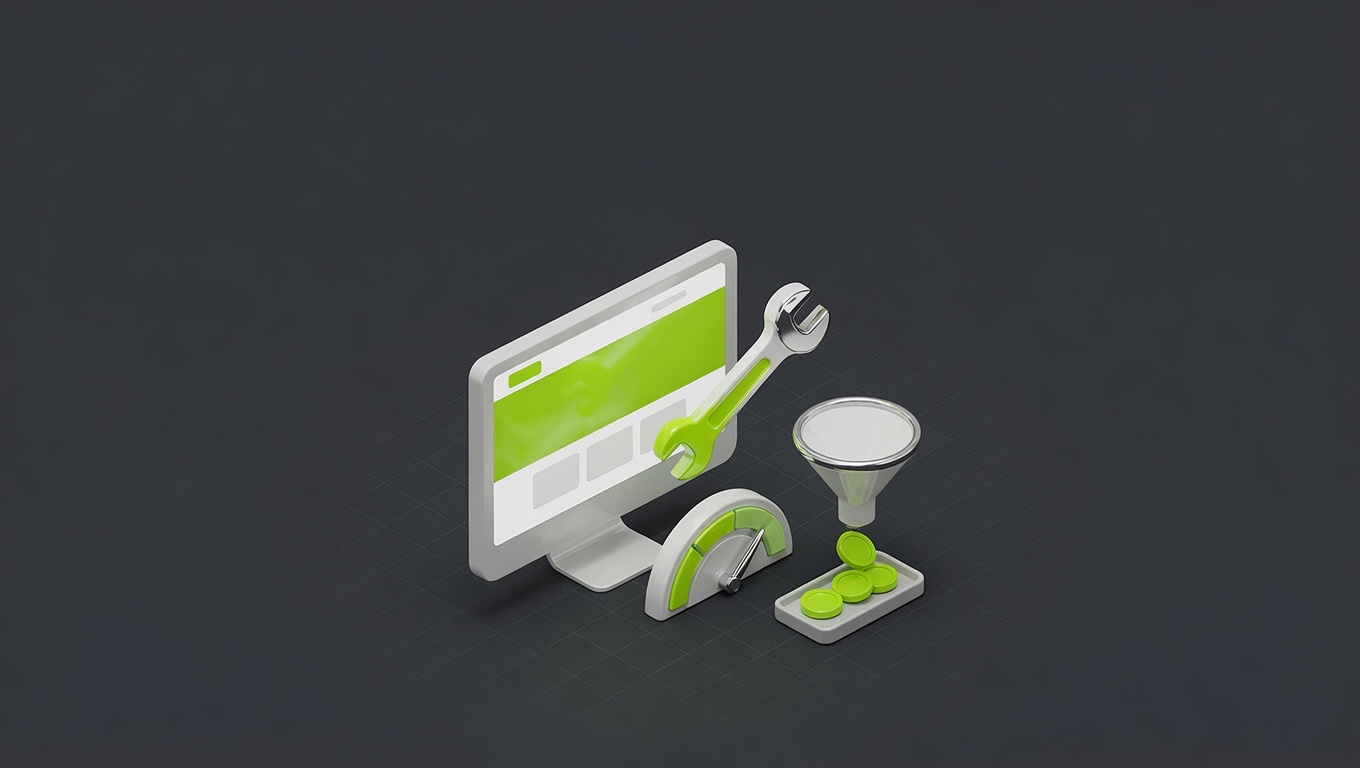
The five reasons (find yours)
Be honest as you read these. Most sites are guilty of at least three, and the first one is the most common and the most expensive:
The five reasons websites don't convert
Find yours. Most sites are guilty of at least three.
The headline doesn't say what you do
Visitors decide in 3–5 seconds. A headline leading with your company name or 'delivering excellence since 2010' answers nothing. It must say what you do and who it's for, instantly.
The CTA is buried or generic
One clear, specific action, visible without scrolling. 'Get a Free Quote' or 'Book a Call' beats a vague 'Contact Us' buried in the footer by 2–3×.
No social proof above the fold
Testimonials, logos, or a hard number ('200+ projects delivered') build instant credibility. Hiding proof on a separate page wastes it.
The mobile experience is broken
60%+ of traffic is mobile. Tiny buttons, pinch-to-read text, and forms that fight phone keyboards silently kill conversions you never see.
It loads in over 3 seconds
53% of mobile users abandon sites slower than 3 seconds. Unoptimized images and plugin bloat are usually the culprits, and the lost visitors never show in your analytics.
If you recognised your own site in three or more of those, good. That's three or more fixable leaks, not a hopeless situation. Let's go deeper on why each one matters and what "fixed" actually looks like.
1. Your headline doesn't say what you do
This is the big one. Visitors decide in three to five seconds whether they've landed in the right place. If your homepage leads with your company name, a logo, or a vague slogan, you've spent those seconds saying nothing. The headline has one job: answer "what do you do and who is it for?" instantly. "We build lead-generating websites for service businesses" beats "Welcome to [Company]" every single time. Specific beats clever. Clear beats impressive.
2. Your call-to-action is buried or generic
Every page needs one primary action, and it should be visible without scrolling. Not four competing buttons. Not a contact form hidden past everything else. One clear, specific CTA, and the wording matters: "Get a Free Quote," "Book a Call," and "Start Your Project" consistently outperform "Contact Us" by 2–3× because they tell the visitor exactly what happens and imply the value. If your main CTA is a "Contact" link in the nav, you're leaving conversions on the table.
3. No social proof above the fold
People don't buy from businesses they don't trust, and trust has to be established fast. Testimonials, client logos, review stars, or a simple hard number ("200+ projects delivered," "rated 4.9 by 300 clients") build instant credibility. Visitors who see proof above the fold are far more likely to keep scrolling and engage. If your testimonials live on a separate page nobody visits, you've hidden your most persuasive asset. Move it up.
4. Your mobile experience is broken
Over 60% of business website traffic is mobile, yet most sites are still designed and checked on desktop. The result is silent carnage: buttons too small to tap, text that needs pinching, forms that fight the phone keyboard. The owner never sees it because they only ever view the site on their laptop. Many of these same failures, tap targets too small and forms that resist input, are also accessibility barriers that turn away buyers and raise legal risk. The fix is embarrassingly simple: pull your site up on your own phone, on cellular data, and try to become a customer. Everything that annoys you is costing you money.
5. Your site loads in over 3 seconds
Google's data is blunt: 53% of mobile users abandon a site that takes more than three seconds to load. Most unoptimized sites (heavy images, too many plugins, no caching) load in five to eight. And the cruelty of it is that these losses are invisible: the people who bounced before the page rendered never appear in your lead numbers, so you don't even know they were there. Run your site through PageSpeed Insights. If you're under 70 on mobile, speed is actively bleeding you leads.
The 30-day fix plan
You don't need to rebuild anything. Here's the order we'd tackle it, front-loading the fast, high-impact wins so you see movement in week one:
- Week 1, rewrite the headline. Make it say what you do and who it's for. This single change often moves the needle most.
- Week 2, add one clear CTA above the fold, plus social proof. A specific button and a testimonial or hard number, visible without scrolling.
- Week 3, fix speed. Run PageSpeed Insights, compress images to modern formats, cut unnecessary plugins and scripts.
- Week 4, fix mobile end to end. Test every key page on a real phone and repair whatever's broken: tap targets, text size, forms.
Measure your conversion rate before you start so you can prove the lift. These four weeks of focused fixes routinely outperform a far bigger ad budget, because they compound on every visitor you already get.
Where to go deeper
This is the diagnostic version; for the full tactical list, our 32-point CRO checklist breaks down every fix with expected lift. And if you're weighing whether to fix or rebuild, what a website actually costs will help you decide where the money's best spent.
If you'd like a second pair of eyes, see the conversion-focused sites we've built, explore our business website and web design services, or book a free conversion review. We'll run your top pages against these five and hand you the prioritized fixes.
Five reasons, one 30-day plan. You almost certainly don't need a new website. You need to fix the leaks in the one you have.
FAQ
Questions, answered.
Everything people ask us about this, answered straight.
Traffic without leads is almost always a conversion problem, not a traffic problem, and it usually comes down to the same five issues: an unclear headline, a weak or buried call-to-action, no visible social proof, a broken mobile experience, or slow load speed. Visitors arrive, fail to immediately understand what you do or why to trust you, and leave. The fix isn't more traffic; it's removing the friction between landing and acting. Diagnose which of the five is hurting you most and start there.
Measure your conversion rate: the percentage of visitors who take your key action (form fill, call, purchase). Most business sites convert 1–3%, good ones 3–5%. If you're below 1%, something on the list above is broken. But the more important comparison is against your own past: improving from 1.5% to 2.5% is a 67% lift in leads from the same traffic. Set up basic analytics, establish your baseline, then fix and measure. If you're not measuring, you're guessing.
Your headline, almost always. If visitors can't tell what you do and who it's for within a few seconds, nothing else matters: they leave before they reach your testimonials, your CTA, or your pricing. After the headline, a single clear call-to-action above the fold is the next highest-impact fix. These two changes alone often move conversion more than a dozen smaller tweaks combined, and both can be done in an afternoon.
Usually not. Most conversion problems are specific and fixable without a rebuild: rewriting the headline, adding a clear CTA, surfacing social proof, compressing images, fixing the mobile layout. A full redesign is expensive, slow, and risks breaking things that were working. Run the five fixes, measure the result, and only consider a rebuild if you're still underperforming after that. Fix first; redesign as a last resort.
A lot, and invisibly. Google's data shows 53% of mobile users abandon a site that takes over 3 seconds to load, and those people never appear in your lead numbers because they left before doing anything. Most unoptimized sites load in 5–8 seconds on mobile. Compressing images, using modern formats, and cutting plugin bloat are among the highest-ROI fixes precisely because the losses are silent. Check yours on PageSpeed Insights; if you're under 70 on mobile, speed is actively costing you.
Because over 60% of business website traffic is now mobile, and a site that's hard to use on a phone loses those visitors instantly. The common failures (buttons too small to tap, text that needs pinching, forms that don't play nice with phone keyboards) are invisible to owners who only ever check their site on a desktop. Pull your own site up on your phone, on cellular data, and go through it as a customer would. Whatever frustrates you is frustrating real buyers.
The quick wins show up fast. Rewriting your headline, adding a clear CTA, and fixing speed affect every visitor immediately, so you can see movement within days to a couple of weeks. Structural and trust changes take a bit longer to read because you need enough traffic to judge. Our 30-day plan below front-loads the high-impact, fast-signal fixes so you feel progress in the first week, not the first quarter.
Start with what you can do yourself: the headline rewrite, adding a CTA, surfacing testimonials, and running a speed test cost nothing but attention. If after those you're still underperforming, or the problems are technical (deep speed issues, a broken mobile build, a site you can't easily edit), that's when professional help pays off. A good rule: do the free, obvious fixes first, then bring in help for the things that need real development.