Here's the moment it goes wrong for most growing brands. The first few pages look great: someone cared, picked nice colors, made the buttons consistent. Then the business grows. A landing page gets added in a hurry. A new team member builds the blog. Someone "just tweaks" a button. Six months later you've got three shades of your brand color, five button styles, and headings that don't quite match, and nobody can say which version is correct. That's not a discipline problem. It's a systems problem, and it has a clean fix.
A design system is the cure, and you need one earlier than you think: roughly the moment your site passes ten pages or more than one person starts touching the design. Let's cover what it actually is, when to build one, the minimum viable version, and how to keep it from becoming a burden.
The 10-page tipping point
Under about ten pages, with one person designing, you can hold consistency in your head. A simple style guide is plenty. But two things break that: page count and team size. Once there are enough pages that you can't remember every decision, or enough people that decisions get made independently, drift is inevitable. Not possible, inevitable. Consistency by memory and good intentions does not survive growth.
The tipping-point signals are concrete: you're past ~10 pages, more than one person edits the design, you're publishing regularly, or you've already noticed inconsistency creeping in. Hit any of those and it's time. Before them, building a full system is premature optimization; after them, every week you wait adds cleanup cost later.
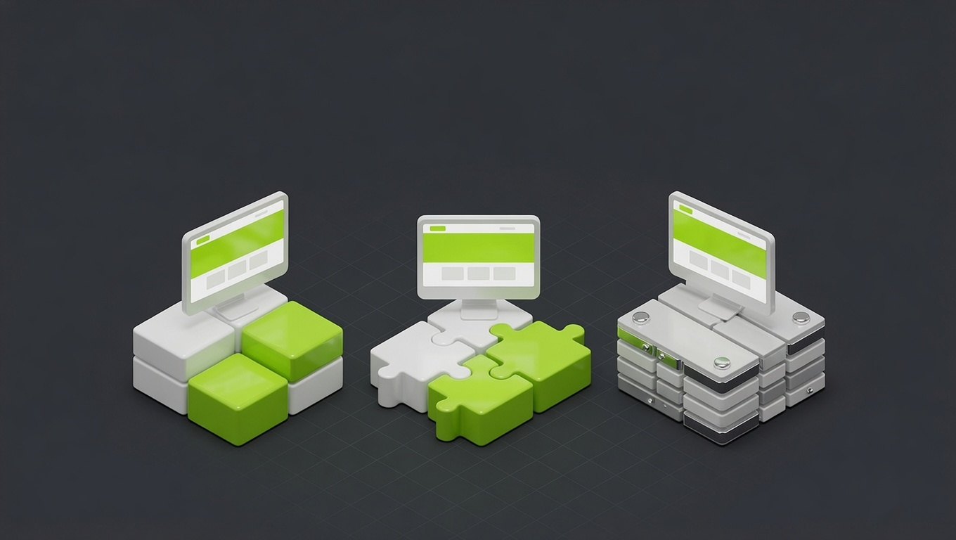
What actually lives in a design system
People imagine something heavyweight. A right-sized one is four simple layers:
- Design tokens: your brand's raw values as named things:
brand,ink,paper, your type scale, your spacing units. Defined once. - Components: the reusable parts: buttons, inputs, cards, navigation. Built once, used everywhere.
- Patterns: how those parts assemble into typical layouts (a standard section, a hero, a form block).
- Documentation: short notes on how and when to use each, so anyone can build on-brand without guessing.
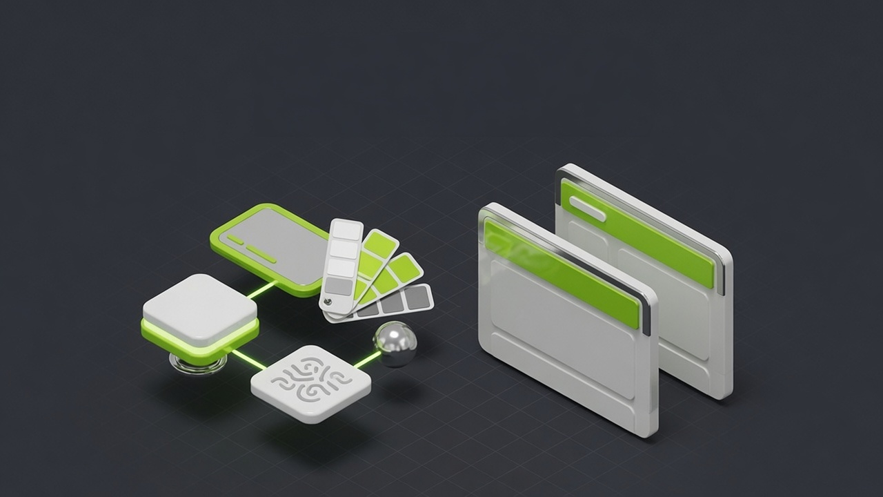
The magic is the tokens. Define your brand color once as a token, and your website, your Figma file, and your Tailwind config all pull from the same source. Change it in one place; it updates everywhere. No more hunting for "which green was it again." Here's roughly what that looks like in practice:
A minimum viable design system, in practice
Tokens defined once, then exported everywhere. No more guessing the hex code.
That build-tokens step is the whole point: one source of truth exported to every place the brand shows up. It's the difference between a brand that stays consistent automatically and one that drifts the moment two people work in parallel.
The minimum viable design system
You do not need hundreds of components. A small brand needs the dozen things it actually reuses. A sensible MVP scope:
- Tokens: colors, type scale, spacing, radius, shadows.
- Core components: button (with its variants), input, card, nav, footer.
- A few patterns: standard section layout, hero, form block, content/blog layout.
- Light docs: a page that shows each component and a sentence on when to use it.
That's it. That covers the vast majority of what you build, and it's achievable in days, not months. Build the system you need now plus a little headroom, not the system a 200-person company needs. Over-building a design system for a 12-page site is its own kind of waste.
Tools, by team size
The right tool scales with you:
- Solo founder / tiny team: Figma alone. A styles file for tokens, a components page, and a shared library. That's a real design system.
- Growing team: add Storybook to document your coded components and keep design and development in sync, so the button in Figma and the button in code are provably the same.
- Either way: if your site is custom-built, your tokens live in the codebase too (CSS variables, a Tailwind config), generated from the same source.
The tool matters far less than the principle: one source of truth that both design and build reference. Get that and you have a design system; miss it and you have two drifting copies no matter how nice the files look.
Keeping it alive without a big team
Maintenance sounds like a burden; it's mostly a single habit. When someone wants a slightly different button, you either use the existing one or add the new variant to the system properly; you don't make a one-off. That discipline is 90% of the job. Beyond that, you add a component when a genuine new need appears and update a token if the brand evolves. That's it. The upkeep is trivial compared to the cost of cleaning up the inconsistency a system prevents.
How we package it
We don't sell design systems as a scary standalone project. We build a right-sized one into any Build engagement, so your site launches on a consistent foundation instead of accumulating drift you'll pay to fix later. Tokens, the components you actually use, the patterns your pages are made of, and enough documentation that your team can extend it without us.
This connects directly to the platform decision in Webflow vs WordPress vs custom code, since a design system lives more naturally in some stacks than others, and to what a website costs, since a system is part of what separates a studio build from a cheap one.
See consistency in action across the brands and sites we've built, explore our UI/UX design and brand identity services, or book a design system audit. We'll tell you whether you're past the tipping point and what a minimum viable system looks like for your brand.
You don't need a 200-component library. You need a dozen consistent parts, defined once, before the drift sets in. Build that around the 10-page mark and your brand stays sharp as you grow instead of slowly falling apart.
FAQ
Questions, answered.
Everything people ask us about this, answered straight.
It's the single source of truth for how your brand looks and behaves: your colors, fonts, spacing, and reusable components (buttons, cards, forms) defined once and used everywhere. Think of it as a kit of pre-made, on-brand parts plus the rules for using them. Instead of redesigning a button every time, you reach for the one in the system. It keeps everything consistent and makes building new pages fast.
Not on day one, but sooner than most think. The tipping point is around 10 pages or the moment more than one person touches the design. Below that, a simple style guide is enough. Past it, inconsistency creeps in fast: three shades of 'brand green', five button styles, headings that don't match. A lightweight design system prevents that drift and saves far more time than it costs once you're growing.
Build one when any of these is true: your site is heading past ~10 pages, more than one person edits the design or content, you're publishing regularly (a blog, landing pages), or brand consistency has started to slip. If you're a one-page business with no growth plans, skip it. If you're scaling content or team, a minimum viable design system pays for itself quickly in speed and consistency.
A minimum viable design system is four things: design tokens (color, type, spacing as named values), a small set of core components (buttons, inputs, cards, nav), a few page patterns (how a typical section is laid out), and short documentation so people know how to use it. You don't need hundreds of components; you need the dozen you actually reuse, defined once and documented.
It scales with your team. A solo founder can do it in Figma alone: a styles file plus a components page. A growing team adds Storybook to document coded components and keep design and development in sync. The key isn't the tool; it's having one source of truth that design and build both reference, so the hex code and the spacing live in exactly one place.
A brand guide is a document that describes your brand (logo usage, colors, voice). A design system is a working toolkit you actually build with; the components and tokens are usable, not just illustrated. A brand guide says 'our green is #00FF94'; a design system makes that green a token your site and Figma both pull from automatically. The guide is the reference; the system is the machine.
Less than the inconsistency it prevents. A small design system needs occasional upkeep: adding a component when a real new need appears, updating a token if the brand evolves. The discipline is resisting one-off exceptions: when someone wants a slightly different button, you either use the existing one or add it to the system properly. That habit is the whole maintenance job, and it's cheaper than cleaning up drift later.
Only if it's over-built. A 200-component system for a 12-page site is bureaucracy, and we'd never build that. A right-sized MVP does the opposite: it speeds you up, because new pages assemble from ready parts instead of starting blank. The rule is to build the system you need now plus a little headroom, not the system a 200-person company needs. Scope it to your stage.